RENT THE RUNWAY
RTR is disrupting the fashion industry by pioneering dynamic clothing ownership, enabling women to subscribe, rent, and purchase designer clothing through its iOS App and Web. Founded in 2009 and went Public in 2021, it has became the world’s first "Closet In The Cloud".


my role
Product Designer III, Growth
report to
GOAL
Design features that are driven by business growth - increasing conversion and engagement rates, time spent, traffic, subscribers, revenue, etc.
Senior Director of Product
Design process
Identify Problem
Pain Point & Hypothesis
User Research
Competitive Analysis
Design Principals & High-level Concept
UX Review:
Low-fi Wireframe
UI Review:
High-fi Prototype
User Testing & Insights
Iterate, Review, Launch
Test, Learn, Iterate
project 1: the paradox
"Let's fix things and make sure we are ready before Fall."
Starting With
Ambiguity:
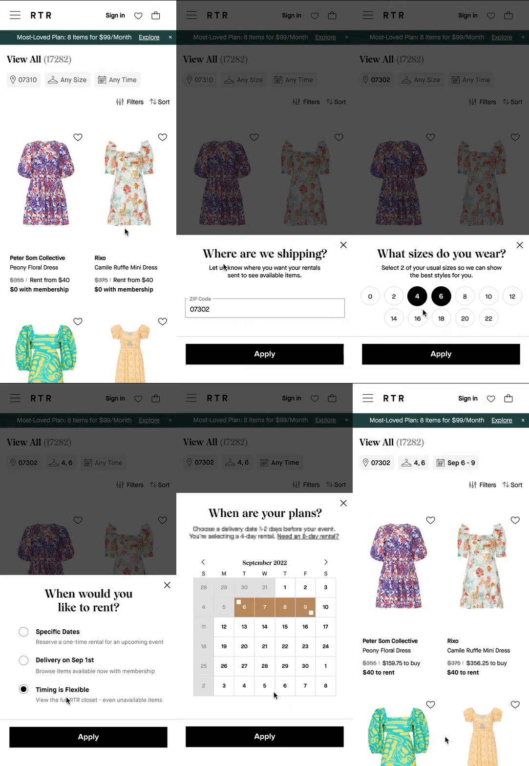
#1 problem that was prioritized from UX Audit was to rethink availability setting system (aka. the "Superbar") that dictates the prospects' experience for browsing and discovering available inventories.
Its actual impact is way more important than what it appears to be - filters. One of the unique challenge for fashion subscription is subjective availability based on one's area, size, and time needed. If prospective users kept on browsing without engaging with the Superbar, they would be wasting time seeing everything including unavailable items, worst case they find out at a much later stage, which has high risk in loosing both customers and revenue.

Easy To Skip
-
Users are not understanding its importance, as it has not been communicated visually.
-
The default grayed-out state seems non-clickable, lacking of clear interaction states.

Invasive Popup
-
Users are not quite ready to give us their zip code before seeing what we offer. The majority of user mindset when land on a shop page is "just browsing", most users usually close popup immediately without reading.
-
A barrier preventing users from achieving desired action, without educational effect.
HYPOTHESIS
Phased Approach
Phase 1: Quick Fix Phase 2: Rethink Holistically
How Might We...
-
ensure all users understand that inventory availability is dependent on their setting?
-
encourage users to interact more and provide us with their accurate input and preferences?

Redesigned the existing UI elements to make the default states look more interactive for increasing user engagement.
Default states changed to 'Any Size', 'Any Time' for creating a more delightful experience, and informative to what users are seeing.

Replace popup with a tooltip for alleviating negative emotions, and as a more effective EDU tool.
(2 versions for A/B test)

Update copies to be more clear explaining why we ask.
(2 versions for A/B test)
Live user TESTING (A/B)
10 Female Interviewees who have never used Rent The Runway before | Age 25-45 | United States
Determine if users understand how to interact with the redesigned Superbar in 2 aspects:
Usability - does the updated UI encourage interaction? do they find the different interaction states to be clear and intuitive?
Content - does the updated copy clearly communicate why and how to engage? do they clearly understand default states and what to do next? are there enough information for making decision?
Sentiment
9/10 users find tooltip as incredibly helpful and not annoying comparing to popups. 3/10 users admit that they usually dismiss popups as conditional reflex behavior before reading any texts.
Expectation
8/10 users find everything as intuitive and smooth, except 2 users imagined clicking on the 3rd pill would see a calendar popup for them to choose dates.
Understanding
10/10 users fully understand the importance of Superbar in their shopping experience. Interestingly, 2/10 users said although they know updating search is better, but still want to ignore to shop first.
Although we see huge success in qualitative(comprehension + sentiment) in phase 1, still have to rethink holistically for improving quantitative metrics(engagement rate/time spent/logic) in phase 2. When users are not engaged with Superbar, it could mess up the whole user experience and cause huge loss for the company, imagine the consequences when booking a hotel/flight without put in dates and cities?
It is a human nature to choose the easy way instead of the right way, but behaviors can be engineered through prioritized information.
insight
PHASE 2 CONCEPT


-
Prominent placements
-
Combine 3 popups into 1
-
Simplify to be glanceable
Theme


Concept 1
Concept 2
Concept 3
Superbar Default State

Stepped Modal For Concept 1

Option 1
Option 2
Option 3
Single Modal For Concept 3
Before, 10+ taps are required to complete the task. Now, with 3 separate popups combined into 1, users are able to finish updating Superbar in just 3-4 taps and done.
project takeaways
Don't ever make users think, guess, do homework before achieving their natural desire. A lot of information can be hidden in a stepped process that are accessible to those who need it. People always prefer bite-sized eye information, so try to turn plain texts into interactive+simple UI elements whenever possible. It is our job to constantly move away from business-centric to user-centric.
Project 2: the muse
Design an emotional quick navigation system to inspire users in their shopping experience for driving business success - increasing conversion rate, page views, and time spent on site.

North Star Concept
Utilize visual elements like icons, curated images, labels to differentiate the emotional navigation with functional navigation like filters. Fashion curations should keep users excited to browse more like albums, instead of solving a specific user need. Quick nav should exist on Home Page, Shop Page, and other high-trafficked pages to disperse users into various interests.

project takeaways
It is key to seek and accept feedbacks from other teams throughout the design process, especially for projects that requires so much cross-functional collaborations like this one.
Scalability and sustainability of each feature should always be prioritized when making a decision for the long run.


