Parisa wang
Parisa Wang is an eCommerce luxury fashion handbag & accessory brand. They have an international customer base with an age range of 18 to 35-year-old.
This is a 6-month project that aims to discover and solve the problem of high bounce rate on their shop page and optimize the user experience on their website on both mobile and desktop.


project duration
July - December 2020
project goal
-
Redesign and optimize customers' shopping experience.
-
Reduce the bounce rate on shop page and increase the conversion rate.
my role
UIUX Designer and Researcher
report to
Parisa Wang Stakeholders & Product Manager
project timeline
July
August
September
October
December
Competitive Analysis
User Research
&Interview
User Journey Mapping&Insights
User Flow
&Wireframe
User Testing 1 for Wireframe
User Testing 2 for Visual Design
Perfecting Visual Design
Finalization
competitive analysis
Compare Parisa Wang's website with 5 other competitors - What UIUX features do they offer?

The major user experience difference between Parisa Wang and its competitors is the options for a more customized shopping experience, which helps to build a more diverse user flow and to meet different users' preferences.
user research & interview
5 Interviewees | Age 23-29 | 4 Female + 1 Male | Located in United States, Canada, and China
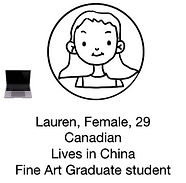
Lauren
29, Female
Canadian
Lives in China
Art Graduate Student
Erin
25, Female
Chinese
Lives in Canada
Legal Assistant
Vivian
26, Female
Chinese
Lives in US
Architect
David
23, Male
American
Lives in US
Fashion Blogger
Charlotte
28, Female
Chinese
Lives in China
Art Teacher
Cellphone user.
Prefers the most comprehensive shopping page with all information shown.
Cares about reviews.
Laptop user.
Prefers clean and minimal shopping page, plenty of white space, loves to use hover effect to see different color options.
Cares about reviews
Laptop user
Prefers clean and minimal shopping page with fewer options, prefer only seeing color options when she chooses to.
Cares about product detail photos.
Cellphone user.
OCD about aesthetics, only likes black/white, Prefer to shop at clean and minimal shopping page with no texts.
Cares about product detail photos
Cellphone user.
Prefer clean and minimal, but seeing all color options of products shown in a row.
Cares about reviews.

user persona & journey mapping
_edited_edited.jpg)
_edited_edited.jpg)
Scenario:
Lauren is looking for a new work bag that is able to fit her portfolio, resume, and iPad for her upcoming job fair, yet makes her look professional and chic.
_edited_edited.jpg)
_edited_edited.jpg)
_edited_edited.jpg)
_edited_edited.jpg)
Scenario:
Erin is casually browsing during work breaks, looking for a trendy bag that enhances her daily work outfits. Her budget varies depending on the quality.
Scenario:
Davie is a high-fashion enthusiast, looking for a new bag with superior-quality and design to complete zir outfit for a street photoshoot. David has OCD and needs to keep things minimal, black and white.
-
No easy access to similar products, or previous and next products.
-
No detailed photos or information about the bags' interior, which mostly caused users to leave the website.
-
Product Details section are too crowded and difficult to use.
-
The shop page is either too much/crowded/overwhelming or too little information for meeting different user's preferences.
-
No filter option on the shop page.
pain point analysis
Users are often overwhelmed by the massive amount of info and options on the site, which leads to the difficulty of finding the bag they want. Users choose to leave in exchange for peace of mind.
Design a personalized filter function on the shop page could help meeting users' different needs or preferences, building customer loyalty, and reduce page bounce rate caused by the "overwhelming" or "unsure" moments.
insight
wireframe
New Features:
1. Sort & Filter Menu
2. Custom Page Setting
3. Accordion Menu for Product Details
4. "What Fits" Illustration
5. Sticky Call-To-Action Buttons
6. New Background and Rounded Style
7. New Pop Up Window Design

usability testing
Mobile
User Feedbacks

1
2
3
4
5
1

User is confused and unsure this is a clickable button, too much text, should seperate into two seperate buttons.
2

Touch area should be bigger, at least 30 px in width.
3

4


5
Too crowded, need to adjust text size, line spacing, and touch area space.
Too crowded, need to adjust text size, line spacing, and touch area space.
A/B Testing: single circle buttons/slide switch buttons

More simple design and bigger texts.
"Get My 10%" CTA button
will better motivate action.
Two seperate buttons "Refine" and "Page Setting", more straight forward and provide options to users
Bigger touch area, easy drop-down menu for mobile users.
Two sticky CTA buttons
Slide buttons are easier to understand and reduce amount of texts
Desktop
User Feedbacks

1
2
3
1

Birthday is a more sensitive and personal info than just "name"
2

A/B Testing: More people prefer the slide button than single circle buttons.

3
Should show a preview of illustration and texts over the box.
After Iteration

visual design & prototype


project takeaways
A good user experience should build around the targeted user's needs and using habits, which greatly influenced by the culture and region that users are living in. For any products that have an international user base, the UIUX features should celebrate diversity and be highly personalizable in order to be visually comfortable and user-friendly.


